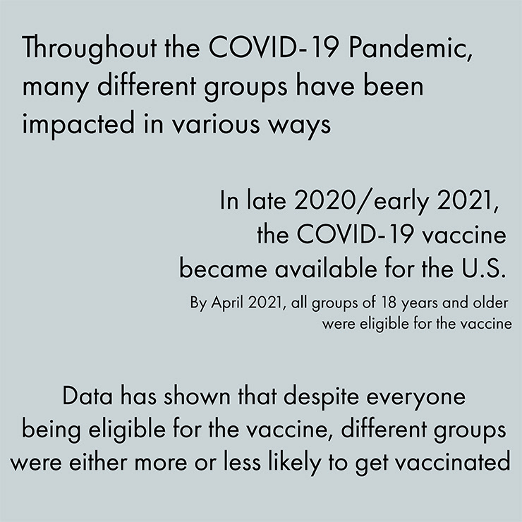
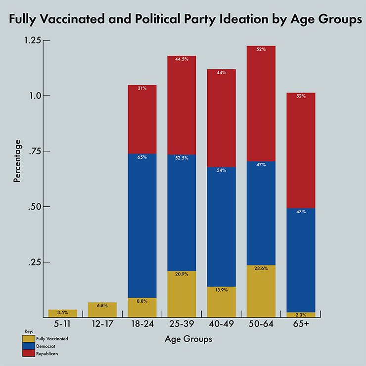
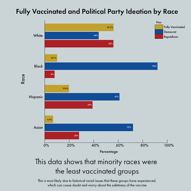
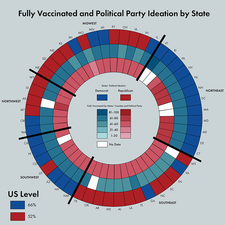
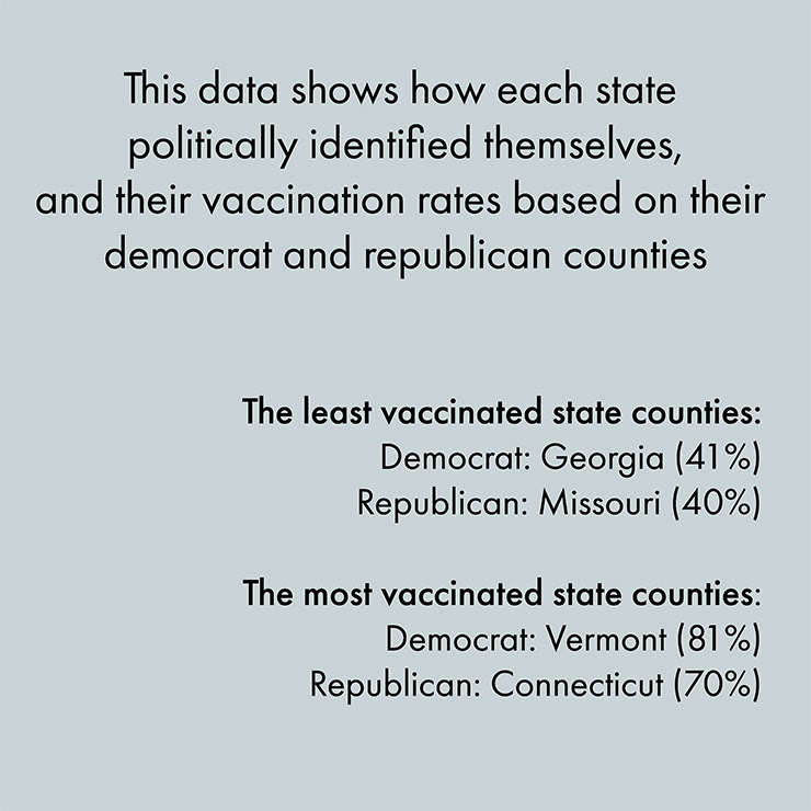
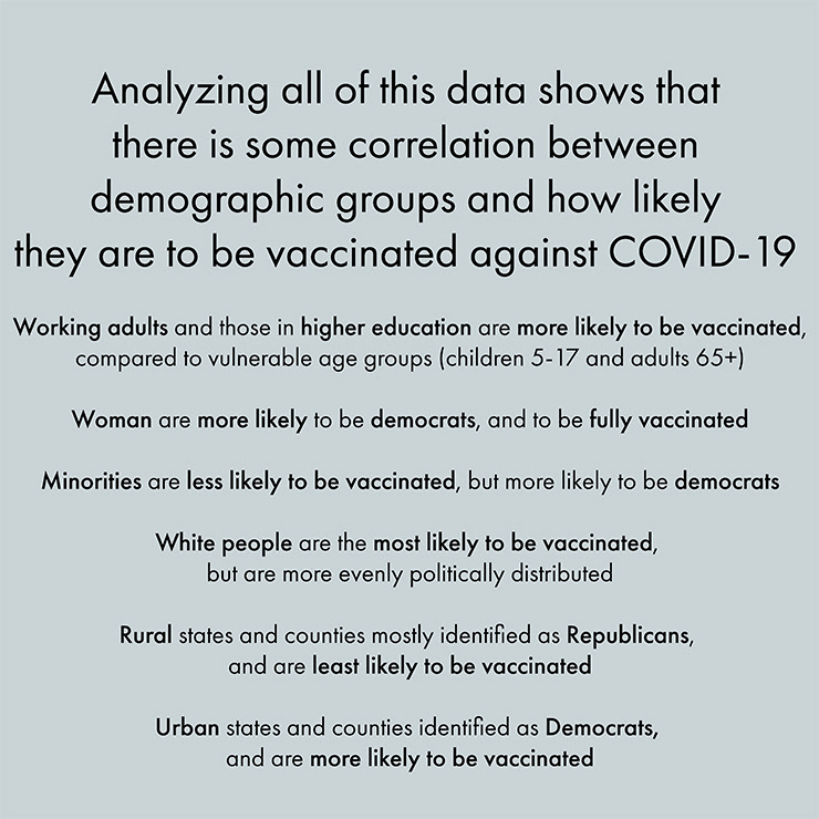
This project presented a unique challenge to visualize open data in a way that effectively communicates a story. I explored several open data portals at the federal and county levels, ultimately focusing on how various U.S. demographics influenced vaccine uptake during the COVID-19 pandemic
After analyzing data from sources like The New York Times COVID-19 case maps, CDC statistics, and other public health datasets, I decided to visualize the findings through a series of Instagram posts. This approach allowed me to present the data in a more engaging and accessible format, leveraging a popular platform to reach a broader and diverse audience
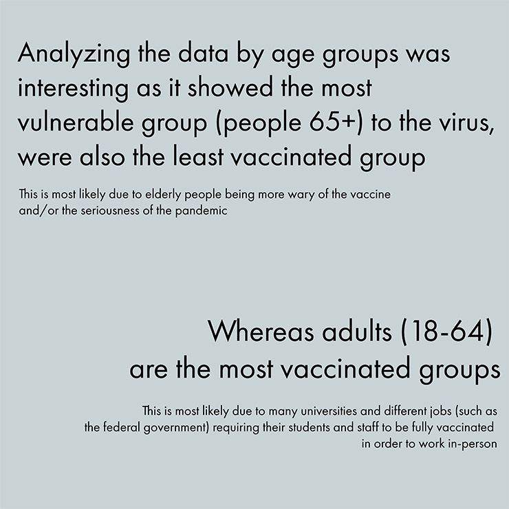
The goal was not only to inform viewers about vaccine distribution patterns but also to highlight the disparities in access and willingness among different demographic groups. This project was a great opportunity to combine data analysis with visual design in a way that can have a meaningful impact on public understanding
PBDS 612 - Creative Methodologies | UBalt | Spring 2022
The Completed Project

The Process
